Festival Logo Redesign
Renaissance Festival
Design Objective:
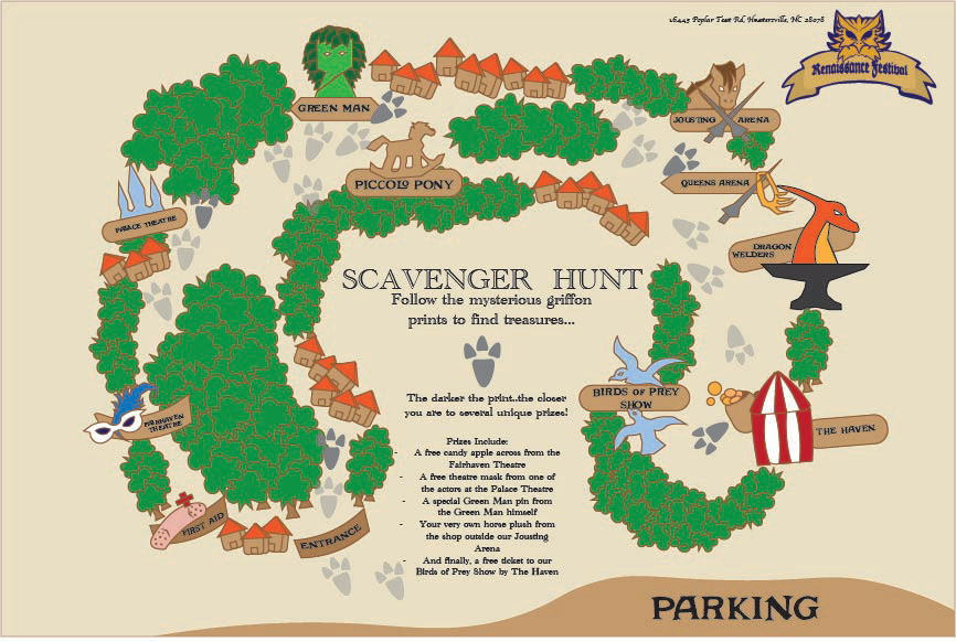
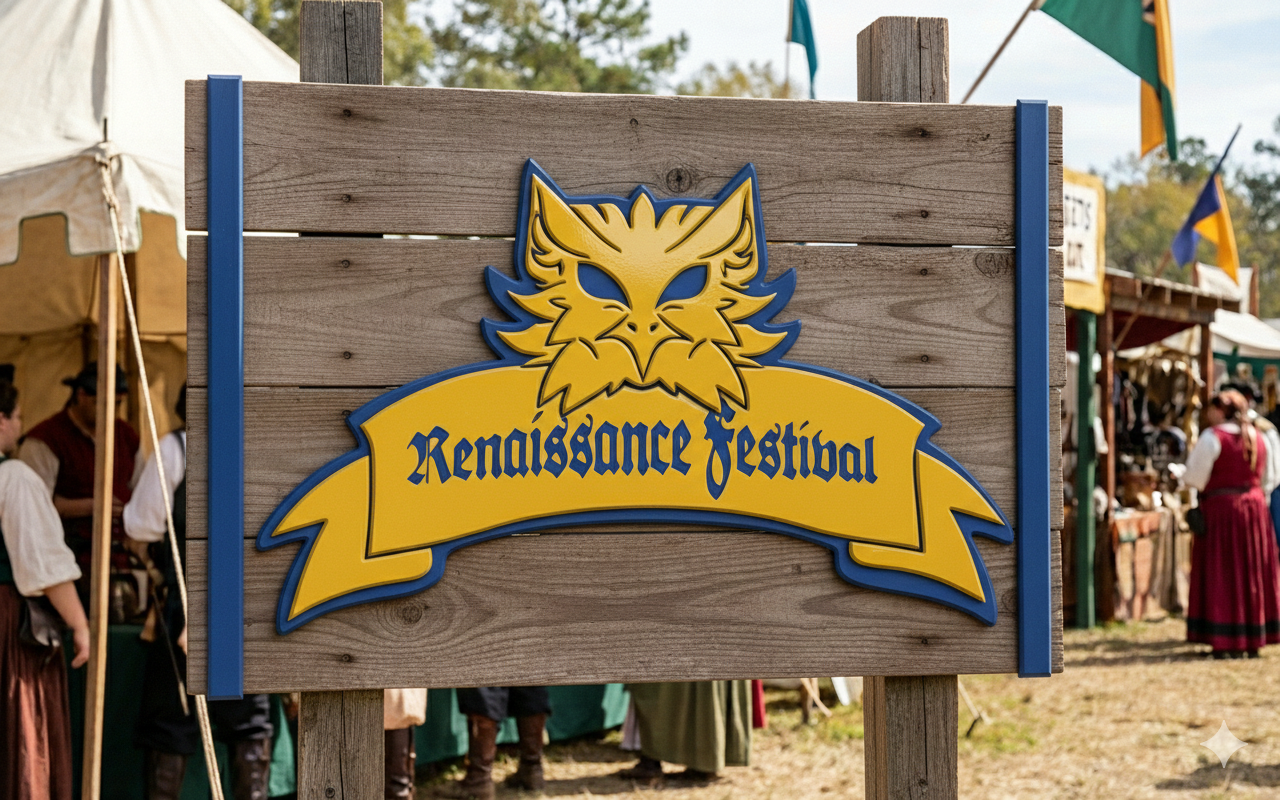
Create a new logo for the North Carolina Renaissance Festival that captures its historic charm while feeling fresh and inviting to modern visitors. Design an updated map with interactive features that helps guests navigate attractions, stages, and vendors more easily to go along with the logo. The goal is to enhance the overall visitor experience through clear, engaging, visual design.
Design Brief:
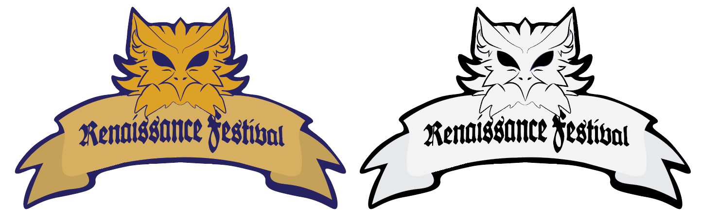
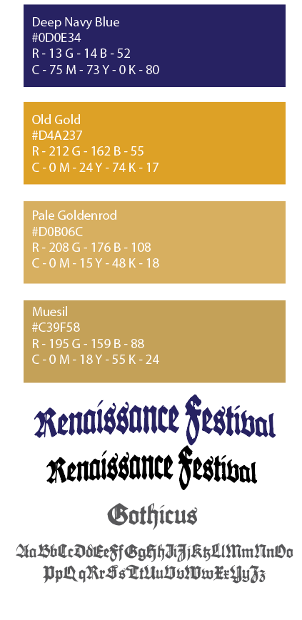
This redesign for the North Carolina Renaissance Festival focuses on honoring the events core values of creativity, imagination, and timeless storytelling while refreshing its visual identity for modern audiences. Retaining the original color palette was essential to preserve brand recognition and maintain the warm, historic atmosphere associated with the Festival. The griffon, a centerpiece of the new logo to reflect the spirit of adventure and defines the festival experience. The medieval-style font complements the griffon emblem by reinforcing the authentic Renaissance aesthetic without sacrificing readability. Additionally, the updated interactive map maintains the charm and layout of the original while improving clarity and user engagement, ensuring that visitors, new and returning, can easily navigate the Festivals performance shops and attractions.
Style Guide
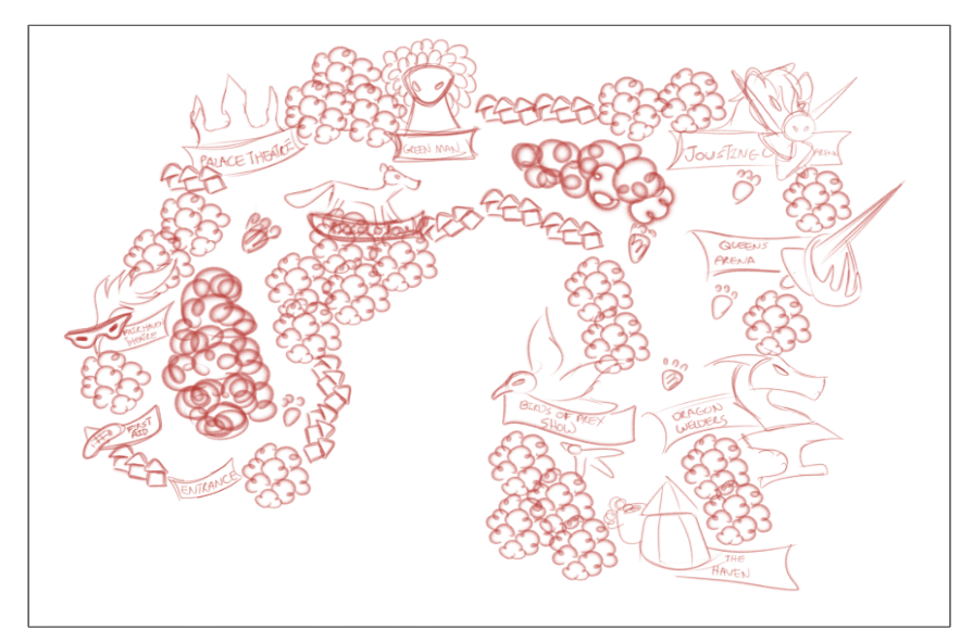
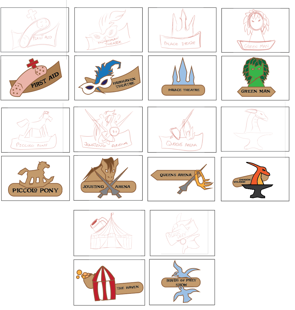
Interactive Map and Icons